Tuesday, 31 March 2009

movie magic

I hate to call any part of the magazine 'a filler', so instead... a cutesy interlude?? Haha, that was probably even worse!
Anywho, I'm planning a feature page on films that have inspired/inspiring styling. It will be very visual, minimal writing... let me know your suggestions. Here are a couple I have thought of already...


Clueless, Breakfast at Tiffany's and Desperately Seeking Susan. Three very different but worthy contenders!

Monday, 30 March 2009

Update

I thought that I would update all on the direction that the magazine is taking. It is no longer carrying the label of 'feminist' magazine. I think it pigeon-holed me a bit, everything was too close and revolved around issues! So I have taken a step back and looking at the magazine as a celebration of women... that phrasing definitely needs re-working but, you know!
I want the magazine to do two things:
Inform. When i was fifteen or sixteen, fashion pretty much meant being a designer. I didn't know all the many different options available within the sphere. And so I have been trying to get in contact with as many women within fashion who do things other than design womenswear clothing... so producer, shoe designer, editor, make-up artist, set-designer, illustrator... In fact Sophie Stephens who is a fashion illustrator has completed the most wonderful q&a for me! She's a star, check out her website:  www.sophiestephens.com
By featuring all these lovely creative women in the magazine, the second thing I want to do is Inspire. Which I hope I will do.
This first issue will carry a feminism theme, I hope the magazine's legacy will be to make being a feminist a cool and proud thing for young girls to be!

T-shirt by House of Holland, Illustration by Sophie Stephens

Friday, 27 March 2009

Changing times...

Oops, I have been so busy and feeling bad that I haven't been posting much, but I don't want to post just any old thing for the sake of it. Hmmm... is nothing better than a half-hearted something?
At this moment I am working on a feature that highlights the change in female body shape that has occurred over the past century. It's a bit of a challenge as I set out for it to be an 80% visual thing, but there is also so much to say, I'm trying to strike a balance...
Check out this image Judith sent me of the type of mannequin used by Vionnet and Lanvin in a Paris exhibition in 1925...


and here's the more familiar model... 

Display Mannequin, Female Mannequin, Fashion Sexy Mannequin

It probably is best if I let the images speak for themselves...
I'll also incorporate magazine covers and celebrity images into the feature.

Sunday, 22 March 2009

Layout Inspirations


A huge issue that I am having, and did not even expect, is the laying out of the magazine... And it seems so easy! I am struggling to give the mag a strong visual identity, and that is what it is craving! I have worked so hard to get strong, interesting content, I need a look that will do the content justice. And so, as well as finishing the few interview questions that I have to prepare, and finishing a couple more written features, the layout is something that I have to seriously take into consideration, and in effect spend a couple of weeks on! gah,,, so so much to do!!! Anyone in London willing with knowledge to help out- please please do so!
Exx


images from Nylon & Lula, among others

Friday, 20 March 2009

Another Peek


This is a follow-on from the Princess Charming shoot a couple of weeks ago, originally showcased on the photographer, Jonathon Grigg's blog, check him out... 

Wednesday, 18 March 2009

LBD

My posting is becoming a bit sporadic, I know. I have had so much to do recently and we are coming to the point where the things I am working on will be going into the magazine. I really want there to be an element of surprise for those interested in the final outcome! so I am trying to be particular about what is going up...

Although, here is an out-take from the shoot I did yesterday... it was a lot of fun!

Sunday, 15 March 2009

What a great cover looks like...

[thefutureiszacefron1.jpg]
I've woken up feeling the pressure this morning... there's just so much to do!

Thursday, 12 March 2009

i heart lula


lula magazine: issue six

Splodges and Spills

I have to start thinking properly about layout and style. I am drawn to paint effects, handwriting, tears and wears. I want the magazine to look tactile, (and of course be tactile) with depth. Almost like a sketchbook feel, but done in a clean, sophisticated way. I guess to put it in a word, personal.
Here are some inspirational images taken from some of the magazines in the csm library, I think these are a mix of I.D and Rubbish...


Wednesday, 11 March 2009

Tuesday, 10 March 2009

know magazine.

I have moved swiftly on to my third title. Thinking of a good magazine name not is not easy! What would you call yours?
Through my last thought process I decided that I had to find just one word that will sum up this magazine, and two thinking weeks later, that word is 'know'.
According to the imac dictionary because I cannot find the oxford:

know |nəʊ|
verb ( past knew |njuː|past partknown |nəʊn|)
1. Be aware of through observation, inquiry, or information
2. have developed a relationship with (someone) through meeting and spending time with thembe familiar or friendly with
. have a good command of (a subject or language).
have personal experience of (an emotion or situation)
. recognize (someone or something)
. be familiar or acquainted with (something)

These are the meanings that I want the reader to be synonymous with throughout the magazine.

Monday, 9 March 2009

Peek at Princess Charming


Today was the shoot for a concept that I pitched a few weeks ago under the post "Rescue Yourself Riding a White Horse". I think it went really well and would like to give a massive thanks to all those involved! xxx
Here is a snippet of the day...

Colour Compliment

High heels

I am thinking to use this whole picture as a colour palette.
Love It.

Sunday, 8 March 2009

I don't drink T

Actually a true, but rather random fact. Here is the point of my pathetic play on words ( I love alliteration!)... so far, so-so..

edit: the image doesn't click to enlarge so:

Coolly defying the fashionable trend of what’s hot or not each season, the t-shirt is the ubiquitous garment that is only second to a pair of jeans in terms of classic wardrobe staple.

Whatever we happen to wear feeds those looking information about ourselves, information that can easily be misconstrued in the cultural stream of ideas. T-shirts became a symbol of rebellious youth in the 1950s, inspired by the on-screen presence of Marlon Brando and the original rebel without a cause, James Dean. A plain white design was then very much a male item and enough to signal a rock ‘n’ roll sex appeal. In the years that followed, the white tee gave way to the printed tee to provide a non-verbal but powerful opinion on everything from the wearer’s musical tastes to sense of humour. One of the most prevalent t-shirt trends that still demand attention today is that of the provocative variety.


And also considering the magazine title... how does this (very rough) possibility grab you?


Saturday, 7 March 2009

final year saturday night


I have pretty much succumbed to the fact my life is not mine until I hand this magazine file to the printers, but it gets a little frustrating from time to time. It's like having a child I guess! I am supposed to be looking after my niece tonight actually, but after a third day of writers block I am 'sharing' the responsibility with my mum. Which means I have locked myself in my room with a grumpy "don't even ask face" on... oops. Not that I'm getting anywhere with the article.
It's the t-shirt one, and I was really excited about it, but having done some research the topic is huuuuge, and I just haven't known where to start.
There is 2 weeks left until end of term which means only two tutorials left with Judith, and then I am writing this magazine solo. I have to do as much by Tuesday as possible to get as much feedback to do improvements as possible...
So I have a super-sized red bull, a valentines-esque box of chocolates, (they were on special offer) and a will not to move until I have reached at least 1000 words.
Here we go...

Thursday, 5 March 2009

*insert several variations of praise

IMG_2257
Image from Preen Magazine
Courtesy of Style Bubble, http://stylebubble.typepad.com/

The Knight.

I'm actually rather surprised that I am in my third month of blogging and this is my first Nick Knight posting! So without further pause, enjoy.

Originally from Vogue UK November 2008


Aptly entitled, "Fantastic Fashion Fantasy"


Designs by Galliano, Viktor & Rolf, McQueen, Comme Des Garcon, Chalayan, Dior, Yamamoto, Issey Miyake, Gareth Pugh and Thierry Mugler


Images taken from www.fashion-ation.net/ System/Assets/hb1.jpg

Wednesday, 4 March 2009

Scribbly-doo-dah!


graphics, graphics, graphics, graphics, graphics, graphics, graphics.


Tuesday, 3 March 2009

Flaunt it?

I have just finished the first article for the magazine- layout and all! It has been a slow progress but hopefully with all the ground work that I have been putting down over the last few weeks things will begin happening a lot more rapidly! layout not shown here- I need to leave some surprises for the magazine =) Here's a snippet of just under 200 words out of just over a thousand...

“If You’ve Got It…?”

Instead of condemning fashion models whose job it is to sell and display designer wares, media attention should point towards female celebrities who are using their bodies to objectify and sell themselves. Celebrities protest to being public property, but are showing us more of their privates than ever before…

It always baffles me when, approaching the visual feast that is the fashion weeks, the media begins to hyperventilate over the subject of size zero. As though the models, so exotic and ethereal, are singularly fuelling this frightening body image. Agyness Deyn and Jourdan Dunn are the current reigning pair; although these girls who are at the top of their professional game are not scarily thin at all. Agyness is lankily slim and Jourdan quite athletic. I am not discounting the fact that many of the catwalk models are quite obviously underweight, yet I struggle to believe that they should be held accountable for the body issues held by the female masses. It seems apparent to me that the likes of Cheryl Cole, touted as the nations sweetheart and a Vogue cover girl, and WAG extraordinaire Victoria Beckham, need to be taken into account . . .

Monday, 2 March 2009

another love.


Flimsy Post / Great Image

Sunday, 1 March 2009

Delving into the Archives!

The previous post got me digging round to find my original sketch book for this magazine project from a year or so ago. As I may have mentioned on regular reader and commenter, David Abstract's blog, I have an interest in psychology and why people make certain decisions. 


Enrolling on a fashion degree such as mine: Fashion Promotion with Communication- and with it being at Central St. Martins, a uni (or art college!) famous for allowing students creative freedom, I have been able to bring my personal interests into the mix and interpret them within fashion. 


I have always had a curiosity of what thought process goes on when people get dressed each day. Each item we pull on goes for a reason... Is it colour orientated? Black to look smart? Yellow because it's sunny? Because its new? Or it's so old you forgot you had it? Because it's raining? Because he likes you in that top? Because you feel comfortable/sexy/confident/cool in that certain thing? Because it has memories attached? Or just because it was clean?


Who made up fashion rules? Why do some people abide by them religiously? Why is it so fun to break them?
I'm thinking of doing a photo shoot which focuses on breaking every typical fashion rule... Navy and Black... Double Denim... Socks and Sandals anyone!!??

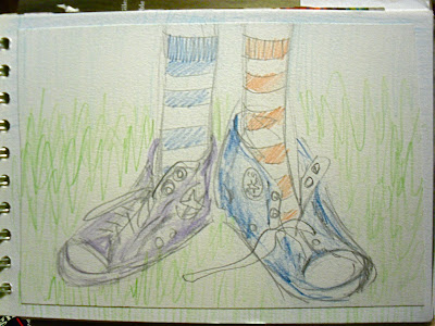
I am very aware that these illustrations are terrible, do not judge me :)

What the F?

 I have a weird fascination (there I did it again...) with the letter F
Not consciously, I'm not that strange, but I do keep coming back to it. I am in the midst of trying to figure out a new title for the looming magazine, and all the words flying around in my brain at the moment begin with F.
Frolics, is the one currently being thrown around, which brought back me to a random phrase that I drew and illustrated, "Can there be frolics without the fun?" Which took me back further to my original idea for the magazine... yes, F.
I was going to call the magazine F*Fashion. Everything in the magazine would stem from F, it was all very exciting-F is a good letter! (Note fashion and feminism) The F would simply be a letter, or the obvious other- 'Fuck'. Yeah, a year ago I actually found this cool. Ok, honestly I don't actually hate it now. It meets my thoughts of not taking fashion seriously, it's style that I am inspired by anyway!
When I first pitched the idea to my tutors for the project, Hywel & Iain (R. Webb!!!) I was met with a such a reaction that made me think that the idea was absolutely awful so quickly forgot about it. A little while later, when our class was all together- which is a rarity in the final year, I realised another girl had the similar idea, but pitched it as a fashion dictionary. That must have been the reason for the tutors' horror after all! sigh... what could have been! The other girl is starting at the beginning of the alphabet with  A, it's a shame that F won't get its deserving chance in the fashion spotlight! :)

Well that was rather self indulgent!